Design Review Board Finds D. P. Dough Sign “Jarring,” New Library Addition “Exciting”
Calzone Shop Chain Founded in Amherst Asked to Consider Less Stark Sign Design
The maxim “Beauty is in the eye of the beholder” never rang truer than at the meeting of the Design Review Board (DRB) on August 28.
See related DP Dough Returns To Amherst But Sign Design Questioned
After seeing the eleven-foot D. P. Dough sign proposed to be mounted in front of the calzone shop’s new North Pleasant St. location formerly occupied by the High Horse, members of the Design Review Board balked.
“The white next to the concrete is a little bit jarring to my eye,” commented DRB member Lindsay Schnarr.
Schnarr suggested that if the sign’s background were black it would be more in keeping with neighboring business signs that are white lettering on black.
DRB member Catherine Porter disagreed, saying “For attracting the notice of the public it is probably better to have a white sign. […] If it’s not standing out, people may not notice it.”
Ultimately the DRB sided with Schnarr and voted to recommend sign creator Robert Salvini of Sunraise Printing run some alternate designs by the D. P. Dough owners to see if they would be open to more black or gray in place of the sign’s stark white.
In an unusual interpretation of the Open Meeting Law, DRB chair Erika Zekos advised Salvini to notify Planning Department liaison Rob Watchilla of the D. P. Dough owners’ decision, and proposed, “I think we can review by email considering that we’ve already had this conversation.”
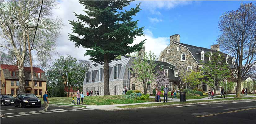
Passel of Town-hired Professionals Defend Jones Library Renovation-Expansion
In addition to Jones Library Board of Trustees President Austin Sarat and Director Sharon Sharry, two project managers of Colliers Project Leaders (Tim Alix, Will Fernandez), four designers from Finegold Alexander Architects (FAA) (Jim Alexander, Ellen Anselone, Tony Hsiao and Josephine Penta), and landscape architect Rachel Loeffler of Berkshire Design were on hand to present the Jones Library Renovation-Expansion to the DRB.
After watching a stylish presentation by FAA, Zekos called for reviewing the project against the nine design standards laid out in the Design Review Board Handbook. Chair Zekos commented on how well the library project complied with each of the design standards and then asked the other three DRB members to weigh in.
Zekos, a senior lecturer in the UMass Department of Architecture who is a former member of the Jones Library Sammys Marketing Committee and who has spoken out to the Town Council in favor of town funding for the project, walked the board members through the project, design standard by design standard. Height, proportions, relation of structures and spaces, and shape raised little negative comment.
Landscaping generated the most discussion, with Schnarr suggesting possible improvements to the walkways and both Schnarr and Zekos questioning the configuration of the rear entryway. Members also expressed disappointment at the number of shade trees that would need to be cut down to accommodate the new addition and stormwater runoff.
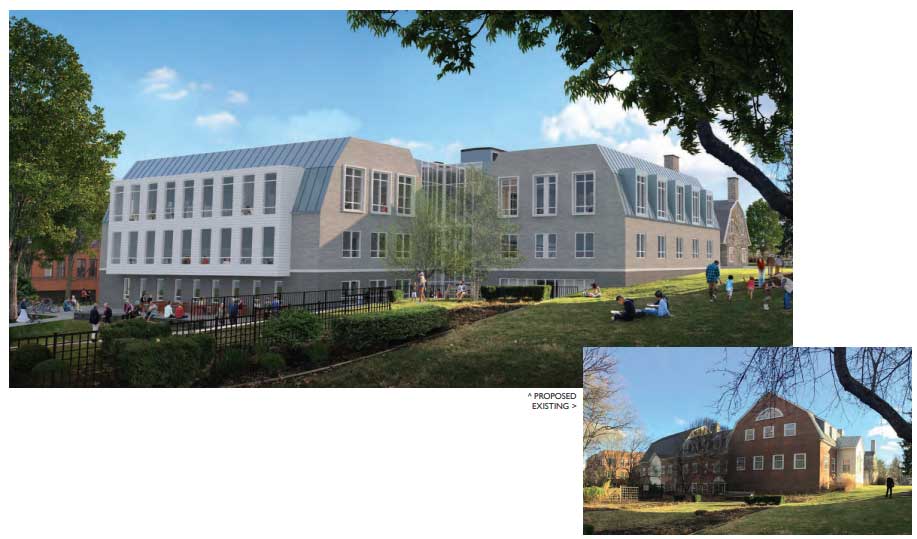
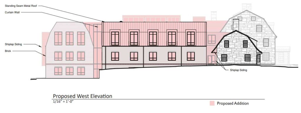
The new addition to the original historic red brick, stone and slate-roofed building was described as being composed of a light-colored brick, white “Hardie Plank” surrounding large windows, metal roofing and an adjacent glass curtain wall. Some might consider this juxtaposition as inappropriate or even “jarring,” but the DRB waved the project through consideration of the Directional expression standard which states that “Building facades […] shall be compatible with those of others in the surrounding area with regard to the dominant vertical or horizontal expression or direction related to use and historical or cultural character.”
Zekos summed up her opinion, “I personally love the big house, little house, back house, barn references. Here again the kind of accumulated-over-time typology, and I think you’ve done a really nice job of maximizing daylight and views without it looking like a glass box except where right at that back entrance is a kind of a connecting glass volume, and I think that feels really appropriate. The horizontality of the brick I think is really referential to neighboring buildings and their clapboard or brick facades and the proportion of solid and void seems consistent with the neighboring buildings as well.”
The contrast presented by the new addition did receive some pushback during discussion of Architectural and site details. Catherine Porter remarked, “I’m not reacting positively to the brick that is currently being considered.” She described feeling that the gray brick of the new addition clashed with the stone of the original building and suggested that a white material might fit in better.
Zekos, too, felt that the addition’s brick color was too neutral. FAA’s Ellen Anselone responded that “we’re trying to keep the addition quiet because the historic building is so lively.”
The review closed with Watchilla reading back a list of recommendations that he had heard raised by DRB members. Zekos asked for a motion to approve the Jones Library building project with the recommendations noted. It was approved unanimously, but without a clear understanding of whether the designers were under any obligation to act on the recommendations.
“I know how long this project has been in the works so it’s exciting to see it move forward,” said the chair.
Following the review, Zekos called for public comment. Hilda Greenbaum expressed disappointment that public comment was not held before the DRB vote. “I really feel that even though they had the big open house and everybody giving comments that the public comment hasn’t been listened to very carefully or Incorporated in any of the designs.”
Architectural historian Hetty Startup followed with two concerns. She felt that the massing and volume of the addition on the North Prospect (west) side “is actually pretty big in comparison to the historic 1928 building.”
Startup also pointed out the existence of a fan-shaped window salvaged from the town’s historic Whipple House that has been incorporated into the library’s 1993 addition that is slated for demolition.
See related The Jones Library, The Old Whipple House Window, And Our Central Fire Station
FAA’s Jim Alexander rejoined the meeting to say that the designers are looking at ways to incorporate the historic window into the new design, possibly by locating it in one of the reading rooms where they “are able to interpret it.” However, the window will not work on the exterior Alexander said.
Startup raised her hand and made a final comment, asking about the thought process that went into the arguably incongruous contemporary barrel vault, large windows and metal roof visible from North Prospect St.
Alexander answered that the metal roof is meant to “stand in contrast to the original building,” with the aim being to make the new addition “contemporary without getting too close to the original.”
Once upon a time, a library was a quiet place for reading, writing, contemplation….
And now it’s supposed to be an “exciting” place too?!
A new definition for the dictionaries…?
Which part of the red brick is historic and which part is the 90’s extension?
Marcus Smith
See the schematic at https://www.amherstindy.org/wp-content/uploads/2023/09/existing-north-elevation.jpg.
The unshaded white area is the historic part of the building that is not planned to be completely demolished.
BTW, anyone interested in the historic preservation questions surrounding the Jones Library project should tune into the Amherst Historical Commission hearing this Thursday, Sept. 14 at 6:30pm. The Commission will be reviewing the renovation-expansion designers’ demolition request and compliance with the Town’s Historic Preservation Agreement.